Anatomy of a Banner
 Thursday, December 15, 2011 at 6:01AM
 I just realized I haven't taken the time to properly introduce my new banner, whose long awaited appearance finally marked the true end of The House of Glib. It's the creation of my friend and co-worker, Nicolas Lambert, who everyone thinks is all exotic because he's from France, but who I really know is just a big nosed geek under that suave sophisticated exterior.
Before he began I gave him a disk filled with 505 different posters to choose from and I thought it would be fun to reveal the 5 posters he sampled from to create his masterpiece.
The only one I recognized immediately when he first showed the banner to me was:
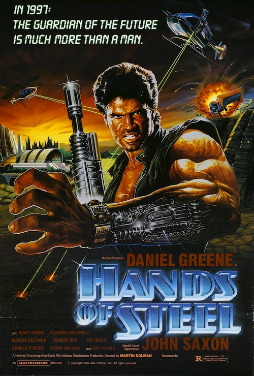
A 1986 Italian movie (aka Vendetta dal futuro), this apocalyptic cyborg classic stars an actor I really only know as the dumb love interest in Elvira, Mistress of the Dark and his brief appearances in all of the Farrelly Brothers movies. I haven't seen it.
The next one I have seen. In fact, I coincidentally watched it for the first time just a few days before Nicolas revealed his finished work to me:
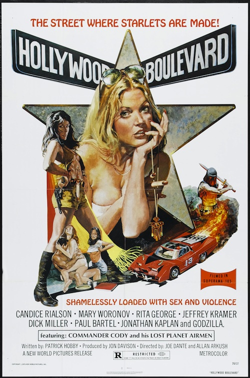
Made in 1976, Hollywood Boulevard is a hilarious satire of low budget filmmaking that was thrown together by Joe Dante and Allan Arkush after producer Jon Davison bet their boss Roger Corman that they could make a movie for less than $50,000 using stock footage from other New World films. They won the bet and miraculously managed to make a genuinely entertaining film at the same time.
The thrilling automobile imagery comes from one of the many movies I actually do have buried in my private collection, but shamefully haven't gotten around to watching yet. (At this point the pile is probably close to 500 movies deep. Maybe more):
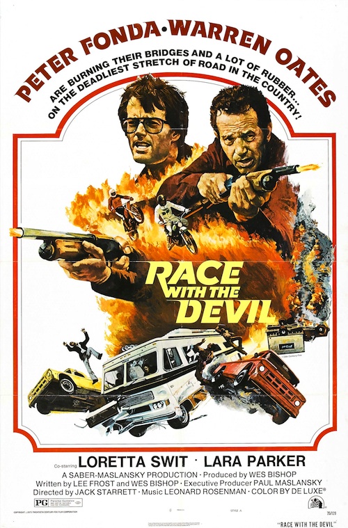
Everything I've heard about 1975's Race With the Devil tells me its a classic. I really do have to get around to watching it sometime soon.
To mess with me, Nicolas threw in some background imagery from the Spanish language poster of one of my all-time favourite bad movies, knowing I wouldn't be able to guess where it was from in a million-billion years:

I have an original vintage copy of the English language one-sheet of 1978's Starcrash and it looks nothing like this one, which features two heroic characters who bear no resemblence to the characters they're supposed to represent. The woman is at least as hot as the actual Stella Starr, Caroline Munro, but the dude doesn't look like any of the men in the movie. At all.
And finally, to bring some classic Man-in-suit B-Movie Bullsh*t flair to the whole thing, Nicolas grabbed the title from the most famous Japanese movie of all time:

So that's how that happened. I hope you like it half as much as I do and if you don't, what the eff is effing wrong with you?

